Industry
Donation Platform
Timeframe
8 Months
My Role
Product Designer
Service
Web & Mobile App

The Giving Project
A 501(c)(3) nonprofit, TGP believes in doing good, smarter through effective altruism and charitable giving. Building accountability, trustworthiness, and measurable impact.
Mobile Weeb Design
Product Design
User Reesearch
User Exppereince


Challenge
Demonstrate the impact of donations to persuade 10% of ordinary people to contribute $1 per month.
Provide a trustworthy, simple, and straightforward pathway to make a donation with little manual work.

Solution


Discovery
I aimed to understand what motivates people to donate. I interviewed 5 charity managers to learn how they engage donors and spoke with 8 individuals (age 20-30) who range from have donated at least once to monthly givers. Additionally, I conducted a competitive analysis of 4 similar donation platforms.
Key Takeaways
People will be more willing to donate if they know the impact of their dollar
People will be more willing to donate if asked
People will feel like they made a difference if they see their impact in real time
A highly expected customer want to
Help find reputable charities to donate to
Social circle is aware of their donations
Check if a charity is using the money well
Increase awareness of problems in the world
Increase feeling of making a difference in the world
Reduce the time it takes to make a donation





Crazy 8 Workshop
The brand manager and I facilitated a design thinking workshop focused on the donation flow. We leveraged Miro for collaboration and utilized Google Slides for the workshop introduction.
-View workshop results-


Color & Typography
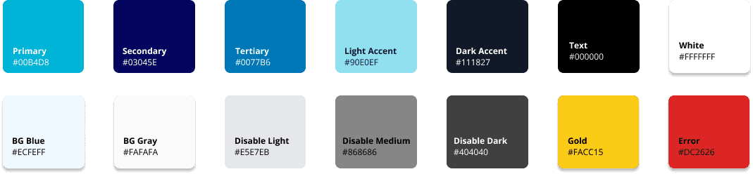

Color Contrast Accessibility - A11y

The color contrast for the primary buttons and the small gray fonts behind the white were non-compliant.

I switched the primary color to the secondary dark blue color, and adjusted the text to a darker shade of gray.
High Fidelity Screen

An overview of the charity is provided to assist users in verifying its legitimacy and reputation.
This page serves as the heart of the project. It provides users with transparency regarding the impact and helps them understand the problem and the solutions the charity aims to address
Usability Testing
Showing the impact helped with transparency, allowing users understand where the money goes to
Stripe transaction fee stopped 60% of users from donating as it felt like a “hidden fee”
Users were unfamiliar with “GuideStar platinum” rating
Rated app simple to donate and informative, liked the impact visuals
Case Studies
This is the subheading or supporting text
© 2026 Zhi Qiu. All rights reserved.